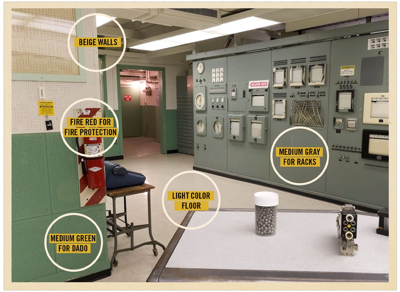
Birren Industrial

I happened upon this blog post by a designer named Beth Matthews about why so many mid-century industrial control rooms were seafoam green. I've long loved this aesthetic since my days working around beautiful cast machine tools painted varying shades of these tones. (In fact, it's the inspiration behind the entire Merriman Industries branding!) Matthews' research added some delightful new trivia: this palette was designed by an early color theorist named Faber Birren.
Serendipitously, the week that I found this post I happened to be doing some customizing of my main Linux laptop, dabbling in "ricing" out my NixOS install and exploring terminal tools and Hyprland. But I wasn't drawn to any of the common dev color palettes like Solarized, GruvBox, or Catpuccin. Then this article and photos passed through my feed and I knew what I had to do.
Introducing Birren Industrial! My personal color palette that I intend to theme all of my dev tools and environments with. The repo contains various themes and resources, including some color palettes and theme files for various tools I use. The number of themes will grow more plentiful and refined as I expand the project but I'm happy to take PRs, suggestions, or requests!
BIRREN INDUSTRIAL PALETTE
Color Theory Foundation
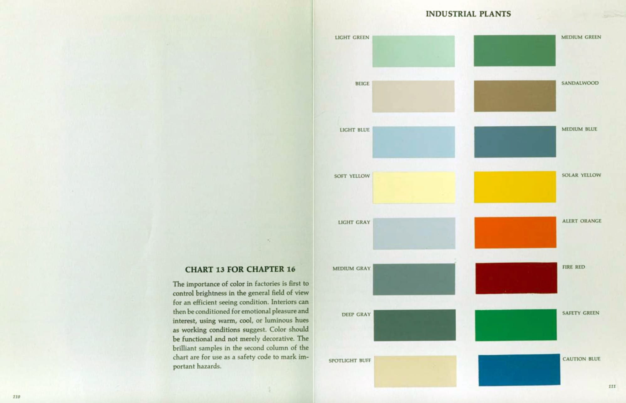
This palette is built on Faber Birren's principles developed for industrial environments during WWII. Birren emphasized:
- Functional Color: Colors serve specific psychological and safety purposes
- Warm/Cool Balance: Birren favored warm tones but recognized the calming effect of cool greens
- Visual Fatigue Reduction: Specific hues minimize eye strain in long-duration environments
- Emotional Response: Colors affect productivity, safety awareness, and worker morale
Application Guidelines
For Digital Interfaces (Terminal/Editor Themes):
- Background: Industrial Charcoal or Machinery Gray
- Foreground text: Instrument Cream or Concrete Base
- Strings: Industrial Seafoam or Dado Green
- Keywords: Hazard Orange or Safety Red
- Functions: Caution Yellow
- Comments: Info Blue (muted)
- Constants: Aged Rust
Birren's Warm/Cool Philosophy:
This palette honors Birren's preference for warm tones while maintaining the functional cool greens essential to reducing visual fatigue. The seafoam serves as a restful anchor, balanced by warm beiges, rusts, and earth tones that create psychological comfort.